I write a lot in Obsidian — research notes, drafts, lecture notes, fragments that grow into essays. The default theme is fine. It is not, in any meaningful way, mine. So I made one that is.
This is a small writeup of that theme, why I made it, and how to set it up if you want to try it. The whole thing is one CSS file, about 9 kilobytes, MIT licensed.
what it looks like
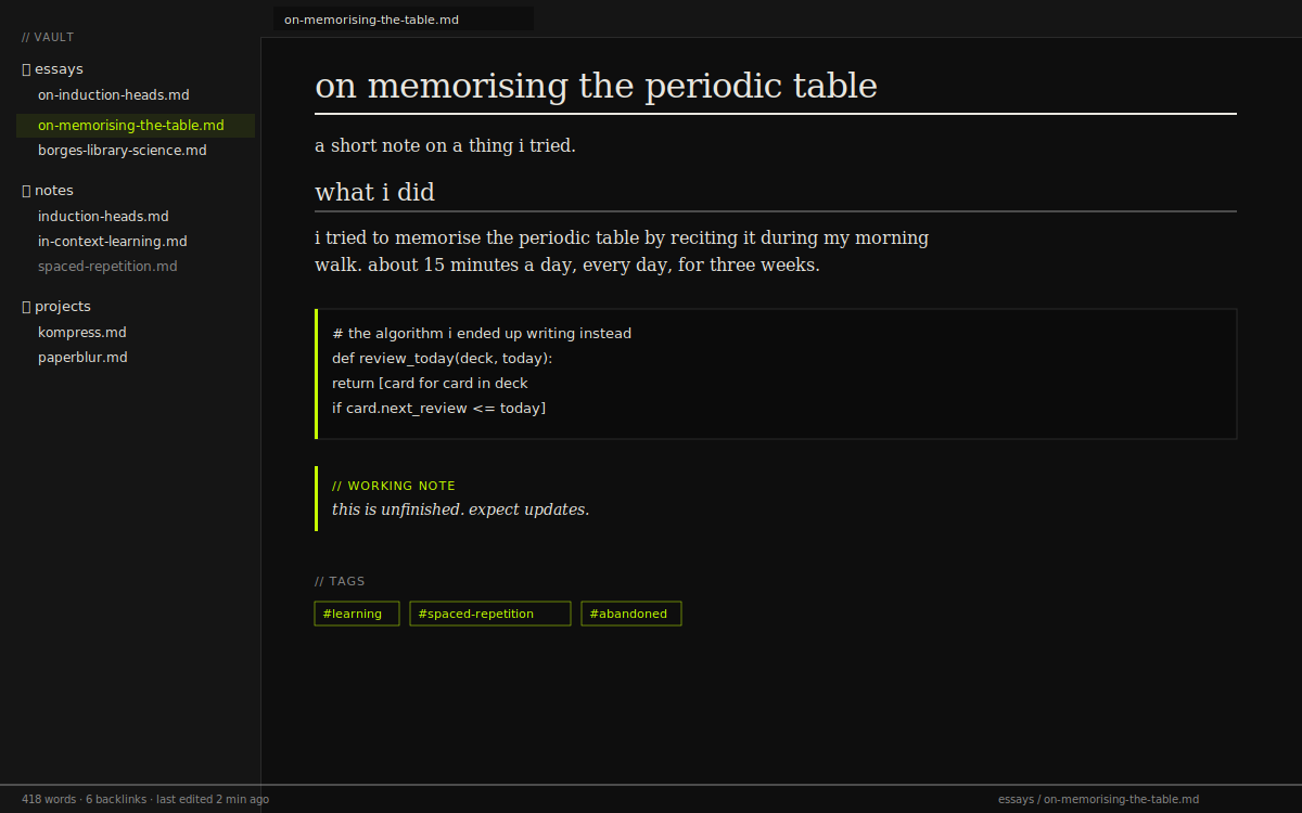
A typical note in dark mode. Body prose in Georgia, headings get the double-rule underline, code blocks have the 3px chartreuse left border that’s the signature of the rest of this site.
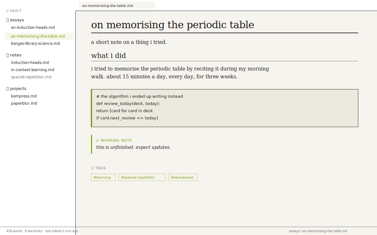
The same note, light mode. Warm paper background, accent shifts to a deeper chartreuse for contrast.
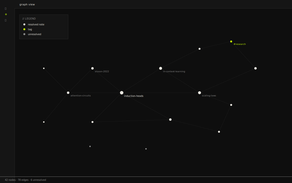
Graph view, retuned. Tags are accent, unresolved notes are muted, lines are hairline grey. Nothing is glowing.
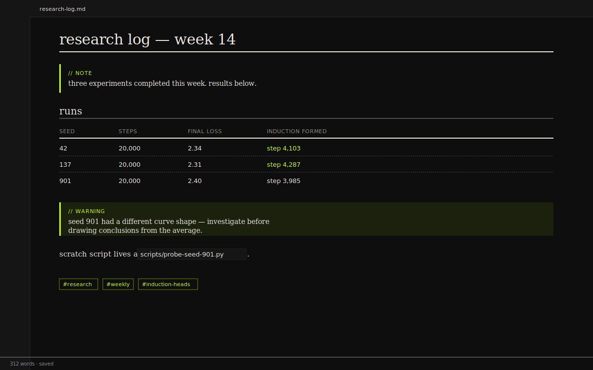
A research log entry showing every primitive the theme styles in one place — callouts, tables, code, tags.
These are mockups showing how the theme renders the major elements. Drop the CSS into your vault to see the real thing on your own notes.
why i made it
The deeper reason isn’t really aesthetic. It’s that I don’t want my note-taking environment to feel like a productivity app.
Obsidian’s defaults — the rounded corners, the subtle drop-shadows, the cheerful pastel callouts — work hard to look welcoming. They’re aimed at someone who needs to be reassured that note-taking can be enjoyable. I don’t need that. Note-taking, like writing, is something I show up for whether or not the tool is cute.
So this theme strips the welcoming bits out. It’s not friendly. It’s not cute. It is, at worst, indifferent — like a paper notebook with a black cover. It doesn’t try to make me feel anything except attention to whatever is on the page.
typography is the whole game
Two fonts. Georgia for body prose, because it’s the most readable serif on every operating system without having to fetch a font over the network. JetBrains Mono for everything else — code, but also metadata, headings, the file tree, the status bar, every UI element Obsidian renders.
This distinction is load-bearing. When I look at the screen, my eyes know instantly: serif means read this, mono means this is structure. There’s no slow visual parse where I have to figure out whether a line is a path or a sentence. The typography tells me before I finish the saccade.
one accent color, used sparingly
The accent — acid chartreuse, #c6ff00 — appears almost nowhere. On hover. On the active item in the file tree. On the 3-pixel border down the left side of code blocks. On tags. On the underline of an h1. That’s most of it.
The rule: never as a background, never on long passages of text, never on more than one element in a row. It should appear as a glance — you notice it, then it’s gone, and you’re reading again. Like a highlighter in the margin of a manuscript, not the cover of a magazine.
sharp corners as a discipline
Everything has zero border-radius. Every panel, every input, every modal, every tag. It’s one of the cheapest design decisions you can make and one of the most consequential. Rounded corners signal safe, friendly, app-like. Sharp corners signal information, structure, paper. Note-taking is the second thing.
After a week of using this theme, switching to any rounded-corner app makes the rounded one feel patronising.
install it if you want
Two files, dropped into your vault. That’s it.
| file | size | download |
|---|---|---|
| theme.css | 9.1 KB | download |
| manifest.json | 280 B | download |
| README.md | 3 KB | download |
Or via curl:
cd YOUR_VAULT/.obsidian/themes && mkdir -p ary && cd ary
curl -O https://aryvectory.xyz/obsidian/theme.css
curl -O https://aryvectory.xyz/obsidian/manifest.json
Then in Obsidian: settings → appearance → themes → ary.
If JetBrains Mono isn’t installed on your machine, the theme falls back to your system mono (SF Mono on macOS, Consolas on Windows, monospace on Linux) — still readable, but loses some character. If you want the real thing, grab it from JetBrains.
changing the colors
Every color is a CSS variable defined at the top of theme.css. Two blocks — .theme-dark and .theme-light — and the rest of the file just references them. Nothing is hardcoded.
Open the file in any text editor (or in Obsidian itself, by opening the theme file as a note). Edit a variable, save. Obsidian re-applies within a second.
.theme-dark {
  --ary-bg: #0e0e0e;
  --ary-bg-card: #151515;
  --ary-fg: #e8e6df;
  --ary-muted: #8a8a8a;
  --ary-acc: #c6ff00;          /* the accent — change this */
  --ary-acc-muted: rgba(198, 255, 0, 0.08);
  --ary-rule: #e8e6df;
  --ary-cb: #2a2a2a;
  --ary-red: #e24b4a;
}
The most useful variable to play with is --ary-acc. Some accents I’ve tried that work:
| color | hex | notes |
|---|---|---|
| chartreuse | #c6ff00 | default. cold, sharp, slightly aggressive. |
| burnt orange | #ff5c00 | warm, autumnal. easier on the eyes during long sessions. |
| electric cyan | #00ddff | technical. coder vibe. |
| magenta | #ff3366 | loud. for people who like exclamation marks. |
| neutral grey | #a3a3a3 | no accent at all. severe. |
If you change the accent, also bump --ary-acc-muted — same color at 8% opacity, used for hover backgrounds. For #ff5c00 that’d be rgba(255, 92, 0, 0.08).
sample note
Here’s a note that uses every element the theme styles, so you can see what’s possible. Copy it into a new note in your vault to compare.
# on memorising the periodic table

a short note on a thing i tried.

## what i did

i tried to memorise the periodic table by reciting it
during my morning walk. about 15 minutes a day, every
day, for three weeks.

| status | days |
| ------ | ---- |
| h to ne     | 3 days  |
| na to ar    | 4 days  |
| k to kr     | 7 days  |
| rb to xe    | 11 days |
| cs onwards  | gave up |

> "memorising periodic tables is the kind of thing
> nobody asks you to do, which means nobody will
> ever know whether you actually did it."

## what i learned

- spaced repetition beats blunt force, but blunt force
  still beats nothing.
- the third row is genuinely harder than the second.
- i stopped at element 54 because i ran out of
  motivation, not memory.

```python
def review_today(deck, today):
    return [card for card in deck
            if card.next_review <= today]
```

> [!note] working note
> this is unfinished. expect updates.

> [!warning] don't trust this yet
> the conclusions in this note are based on n=1.

#learning #spaced-repetition #abandoned
In the rendered view you get H1 with the 2px accent underline, the H2 with a thin muted underline, tables in mono with dashed row separators, blockquotes with a muted left border, callouts as hairline blocks (no emoji icons), code blocks with the chartreuse left border, tags as small mono pills.
things i left out on purpose
No syntax-highlighting tweaks. Obsidian’s default code coloring is fine and a thousand themes have over-styled it. The chartreuse border around the block is enough.
No custom icon set. The few Obsidian icons that remain (the gear, the search) inherit from the OS. One less thing to maintain.
No toggle for compact / spacious mode. Write more if your notes feel cramped, write less if they feel sparse. The theme is whatever it is.
fork it
Single CSS file, MIT. Fork it for your own personal aesthetic — the variables at the top do all the heavy lifting and you can recolor the entire theme by editing nine lines.
If you publish a derivative, attribution is appreciated but not required. If you ship it commercially, please at least pick a different accent so we’re not stepping on each other.
Questions, bug reports, or “I forked it and made it teal” → email me. I don’t run an issue tracker for this.